Table of Contents
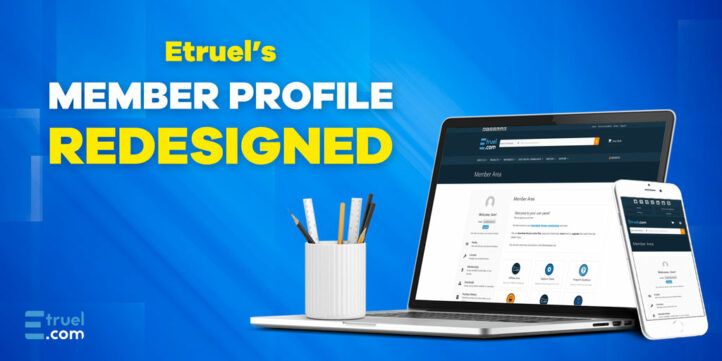
Member Profile Redesigned
We are pleased to announce the recent launch of the new user profile on etruel.com. Yes, as you can see, we have redesigned the user profile! Last week we have completed a total and intuitive redesign that will enhance your experience on our platform! We have made significant changes, including modifications to the layout, colors and the addition of sidebar items with quick access to the most important functions you need to have at hand. In addition, we’ve made it easier to find and download the plugins you’ve purchased, so let’s learn more!
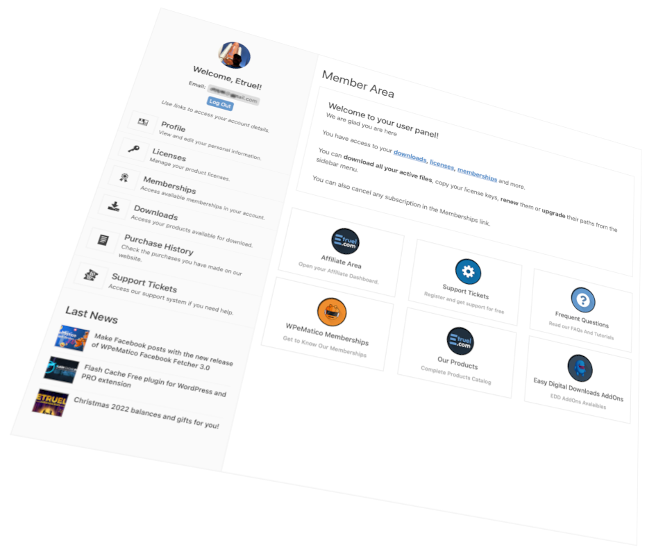
A new Dashboard for members as the main screen of the profile.

Already available from the main menu bar on the far right hand side under the “Members” item, we access the User Profile. We have also added several shortcuts to the affiliate dashboard, support tickets and product catalog, among others.
The latest news that appear in the sidebar are an interesting resource for the user to keep up to date with our articles published on the blog when accessing their profile.
Improved styles and colors to enhance the user experience.
First, we have completely redesigned the section. We have renewed the visual aspect to offer you a more attractive and modern environment. The new colors and general aesthetics give it a fresh and pleasant look, to improve the user experience. We hope you like the new look of the platform.
A new Sidebar with all the shortcuts that matter.
One of the most notable improvements is the addition to the sidebar of shortcuts to the most relevant functions. Now, you will find everything you need in one place. You won’t have to navigate through different sections to access the information you are looking for. From the sidebar, you can easily access downloads of purchased plugins, get help from the support team and keep up to date with the latest product updates.
An improved Catalog to be able to download directly from there all the purchased products.
As for the downloads of the purchased plugins, we have simplified the process to make it more comfortable and faster. Off-stage and as an extra to the user’s account, but totally related to the downloading of the files, in addition to the Downloads section in the profile, now also in the catalog, you will find a download button next to each of the plugins you have purchased. This way, you will be able to get the latest versions with a single click and enjoy all the features they contain.
New screens for receipts, invoices, licenses and memberships.
We have also improved all the screens of invoices, licenses and memberships to have clearer information, such as access to renew licenses or increase the license of the purchased product and cancel or renew your current memberships or subscriptions.
We continue with the automatic invoices for credit card payments, Google and Apple Pay and the other payment methods available through the Stripe payment platform, visible according to the country of residence of each user.
And with the standard receipts for PayPal payments, remembering that for the latter, if the ticket is not enough in your country, then you can request an invoice through a support ticket and we will send it to you personally through one of our agents.
Conclusion
In summary, the new user profile in etruel.com is a comprehensive and intuitive redesign that will provide you with a totally improved experience.
We hope you enjoy all these improvements and that your experience on etruel.com will be even more comfortable and satisfying. We are committed to providing you with the best platform for your plugin needs and we hope you will take full advantage of all the new features we are adding.
Thank you for being part of the etruel.com community and for your continued support.
Remember to take a look and enjoy our free products on WordPress: WPeMatico and Flash Cache 😉
Best regards,
The etruel development team


